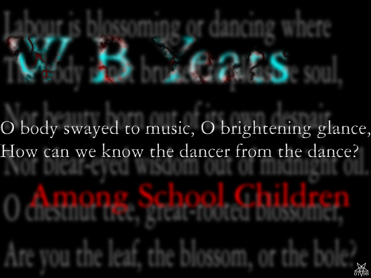
How can we know the dancer from the dance?
.
[1200x900] [1024x768] [800x600] [640x480]
I’ve always loved that couplet. I knew there was no point in trying to fit the whole poem on the screen, so only added a few other lines. This leaves the viewer with the impression that the graphic is just a segment of some larger whole, that the grey lines in the background continue up and down.
This is not one of my favourites; while I like it, I just don’t think it does enough.
How it looks depends a lot on the monitor it is viewed with; the brightness of the background lines varies a great deal on different screens.