Typeface Considerations
.I used to be somewhat obsessed with fonts. When I was doing more graphic design, I regularly looked for new fonts, tried to use just the right font for just the right occasion, and generally was very picky about them. Over time, that’s faded considerably, and I settled down to using fairly unspectacular fonts for most things, accepting that for the most part the “basic” serif and sans serif fonts available on the majority of systems were good enough.
After a system upgrade today, Lucida Sans Typewriter, the font I’ve been using in jEdit, suddenly stopped working properly without anti-aliasing. I couldn’t get it back to what it had looked like before, and so I was left with finding another suitable editor font.
While it was fine, I was never completely happy with Lucida Sans Typewriter. I’m not completely sure why. I spent a bunch of time looking for a replacement, and whlie I think I haven’t one, I’m not completely sure.
I write more or less everything in jEdit now, and this means that the typeface needs to work both for code and for other writing. Non-code text has some different requirements, primarily looking good and readable in long paragraphs. I write and code white (technically changed today to RGB 216/216/216 grey) text on a black background, which also changes which fonts are likely to work. I’m currently working on OS X—I would love to find a font that’s completely cross-platform and which looks the same everywhere, but I doubt that’s entirely possible. Lastly, just to add an extra wrinkle, my monitor seems to emit a high-pitched whine when certain fonts are used to display a lot of white-on-black text, so I had to find a font that didn’t make that happen.
I’m not going to show screenshots, because when I was looking for these the screenshots were useless, and I had to test all of them out in jEdit.
This is the list I came up with, with the font I’m currently using in the number one spot:
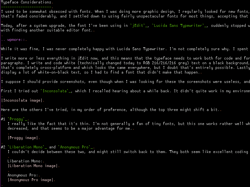
- ProggyCleanSlashedZero
I really like the fact that it’s thin. I’m not generally a fan of tiny fonts, but this one works rather well while being quite small. The fact that it’s thin means that the amount of white I’m looking at while working is decreased, and that seems to be a major advantage for me. This one does get a screenshot:
One problem with Proggy: it turns out that it, plus jEdit, plus OS X, get confused about the width of some characters, like curly double quotation marks, and so the more of those you use in a line, the more distance there is between the cursor’s apparent position and its actual position, I’m not sure if this will be a dealbreaker, and for most coding applications it certainly wouldn’t be. But it might be enough to push me to one of the next two fonts.
- Liberation Mono and Anonymous Pro
I couldn’t decide between these two, and might still switch back to them. They both seem like excellent coding fonts to me. - Droid Sans Mono
- Deja Vu Sans Mono
These last two seemed extremely similar to me; I doubt I’d be able to state which was which if tested. - Lucida Sans Typewriter
Still an excellent font. I’m hoping that Proggy turns out to be better in the long run, but Lucida Sans Typewriter did work fine for me for a long time.
Inconsolata, which I recalled hearing about a while back, is also worth examining.
I got a lot of this font information from the excellent post “Top 10 Programming Fonts” at Hivelogic.
07 Aug 2009 at 09:02
Inconsolata 11 (or 13, avoid 10 and 12) ftw. After spending countless hours searching for the right typeface, this is what I settled on. I use it white on black anti-aliased in MacVim and Terminal.app, but it works well black on white, too. Good luck finding a font that actually looks good cross-platform, or even cross-application when you’re using Windows. I use Terminal 6 (no aa) in Windows gvim, but ProggyTinyTTSZ 12 (with aa) in Eclipse.
On the other hand, I can’t believe you would consider something as repulsive as the Proggy as seen in that screenshot, so my recommendation might not be helpful.
Minor correction: s/doublt/double
07 Aug 2009 at 12:29
+1 for Inconsolata
(Interesting that Seth, above, is also a MacVim + Terminal (iTerm in my case) addict)
But hell, it looks good on Windows in PuTTY
Honorable mention to Deja Vu Sans Mono, my previous favorite (Inconsolata took over)
07 Aug 2009 at 12:36
I can’t believe you can tolerate that “f”.
When you come over I’ll teach you about *real* mono-spaced fonts.
18 Aug 2009 at 06:32
I switched over to Liberation Mono after about a day of using ProggyCleanSlashedZero. The whole issue with the fonts was apparently caused by something in the JVM update for OS X, which more or less made Java apps leave antialiasing on all the time. ProggyClean didn’t have that problem, which is why I gravitated towards it.
I use Liberation Mono (13-point) in both jEdit and MacVim at the moment; it looks better in MacVim, but is bearable in jEdit.